
Therapia Staffing Web Redesign
Company
Therapia Staffing
Role
Graphic Design Intern
Time
6 Weeks
Problem
As a small agency competing in a crowded market, Therapia Staffing needed a website that clearly communicated its value and made it easy for both clients and candidates to take action.
The existing site presented several key usability challenges:
Disorganized content, making it difficult for users to find relevant information
Redundant pages and messaging, leading to confusion and inefficiency
Inconsistent visual design, reducing trust and perceived professionalism
These issues created friction in key user journeys, particularly around exploring opportunities and navigating the job search experience.
Process
I was the sole designer on this project and led the end-to-end redesign of the website experience.
To identify and prioritize issues, I conducted:
A heuristic evaluation to assess usability gaps
A competitive analysis to understand industry standards and patterns
From this, I defined and prioritized core problem areas based on their impact on user experience and business goals.
Information Architecture & Content Strategy
To address content disorganization and redundancy, I restructured the site’s information architecture.
Created a revised site map to clarify content hierarchy
Consolidated redundant pages and streamlined messaging
Reorganized job search content to better align with user expectations
This restructuring improved content clarity and reduced cognitive load, making it easier for users to navigate and find relevant information.
Job Search Experience
The job search function was a critical user flow that required significant improvement.
Reorganized job listings for better scanability and relevance
Developed a working prototype in Adobe XD to demonstrate the improved experience
Simplified the interaction model to support faster decision-making
This created a more intuitive and efficient pathway for users searching for opportunities.
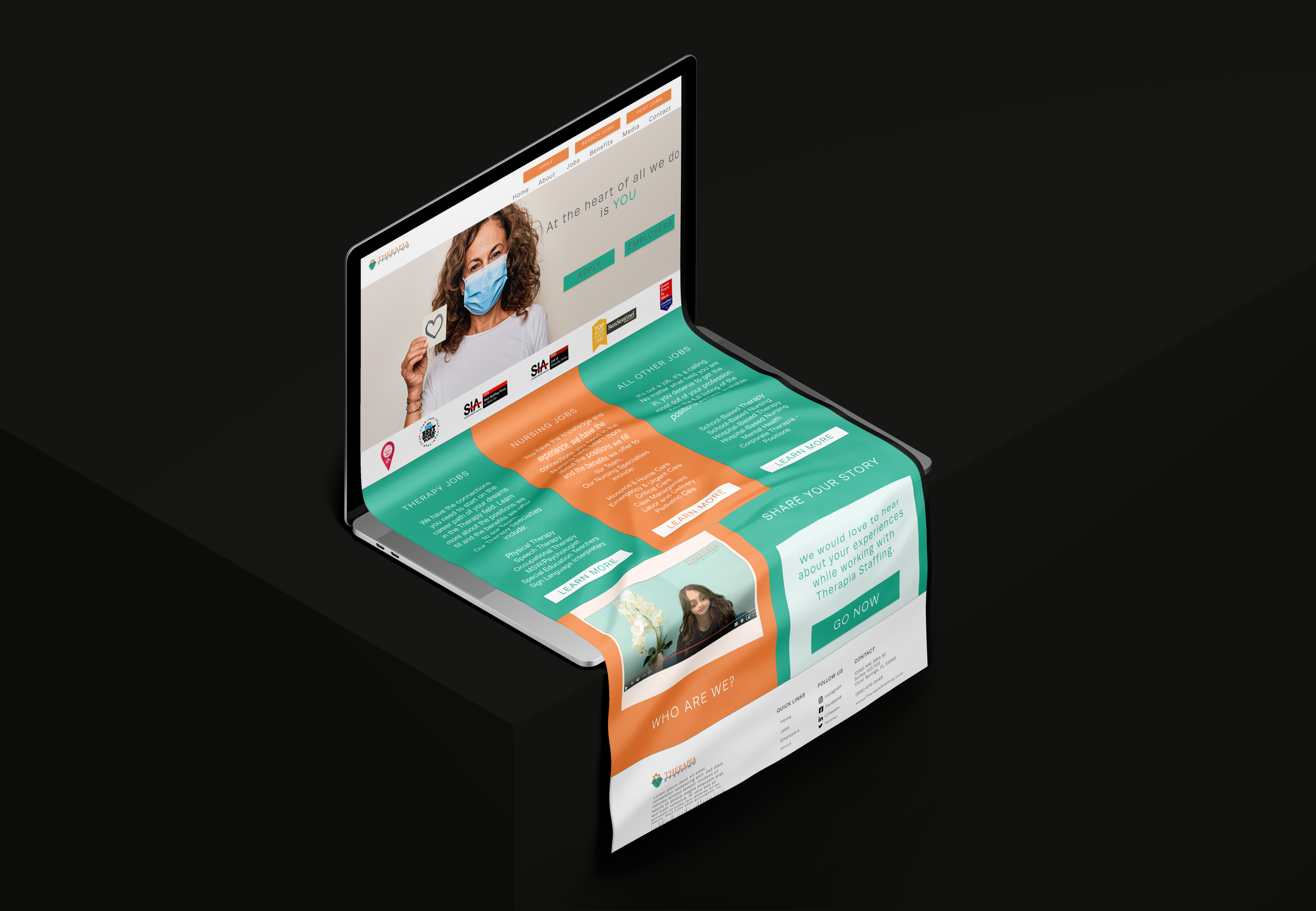
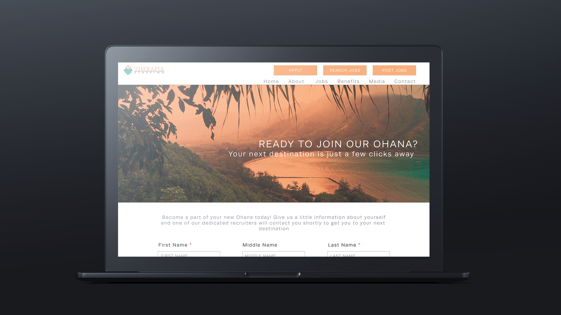
Visual Design & Branding
To resolve inconsistencies in the site’s look and feel, I introduced a cohesive and modern visual system:
Standardized typography, transitioning from serif to sans-serif for improved readability and a more contemporary feel
Designed consistent page layouts with structured header sections
Introduced customized header imagery to create a more polished and personalized experience
Selected imagery that emphasized travel, destination, and lifestyle, aligning with the appeal of travel-based roles
I also incorporated branded elements inspired by Therapia’s “Ohana” concept, reinforcing a sense of community and care throughout the experience.
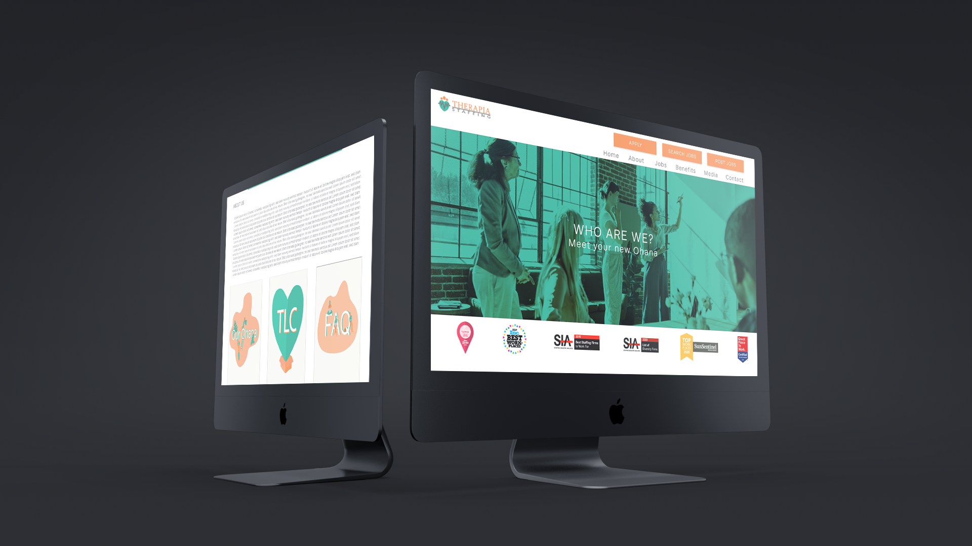
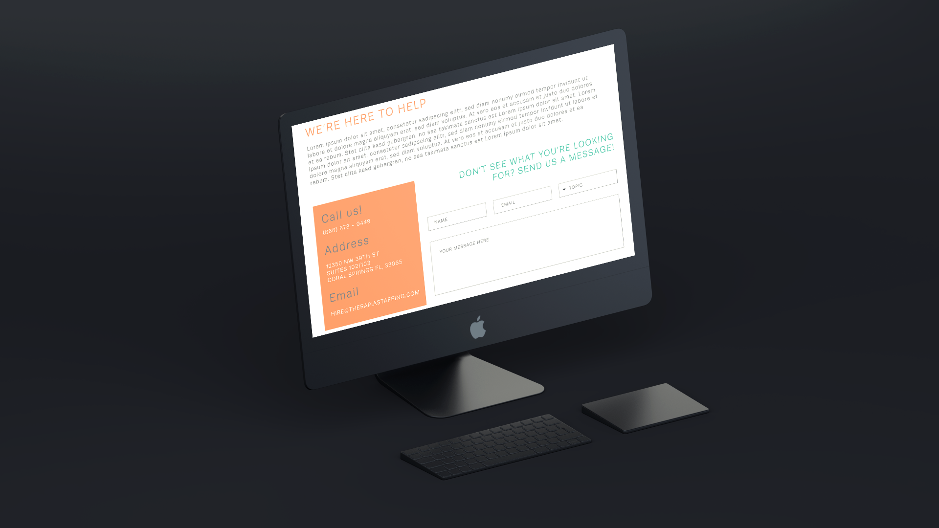
Navigation & UI Improvements
Simplified and reorganized navigation to improve usability and reduce friction
Standardized UI components for consistency across pages
Designed custom illustrations to enhance key interactions and calls to action
Integrated new program content (TLC initiative) into the overall experience
These changes created a more cohesive and user-friendly interface while strengthening brand identity.
Results
Although the redesigned site was not ultimately launched due to organizational changes, the project successfully demonstrated a clear improvement in usability, structure, and visual consistency.
Stakeholder feedback was highly positive, particularly around:
Improved clarity of content
More professional and cohesive visual design
Stronger alignment with user needs and business goals
This project highlights my ability to independently audit, prioritize, and redesign a complex website experience—balancing user needs with business objectives in a resource-constrained environment.
Reflection
If I had the opportunity to go back and complete this project I would definitely proceed with the development
of this site. I now possess all the skills necessary to easily launch this site and I would love to have the opportunity to see it go live.