Dutch Bros
Company
Dutch Bros Coffee for Arizona State University
Role
Research Phase: Project Manager
Throughout the Project: Graphic Designer/UX Researcher/Visual Designer
Time
4 Weeks
Problems
Dutch Bros’ Website is not very user friendly and makes it difficult for users to complete essential tasks, such as finding a location, ordering online and contacting the company.
Redesign Approach & Prioritization
When approaching the redesign of the Dutch Bros website, I prioritized issues based on their impact on user drop-off and overall usability within the project timeline.
I first addressed critical functionality gaps, specifically the lack of clear Contact Us options and friction in the online ordering experience, both of which could cause users to abandon the site.
Next, I focused on structural and navigational issues, including inconsistent link styling, unclear navigation patterns, and the separation between the main site and the online store.
Finally, I refined visual inconsistencies, such as typography and styling, to create a more cohesive and accessible experience across the site.
Navigation & Site Structure
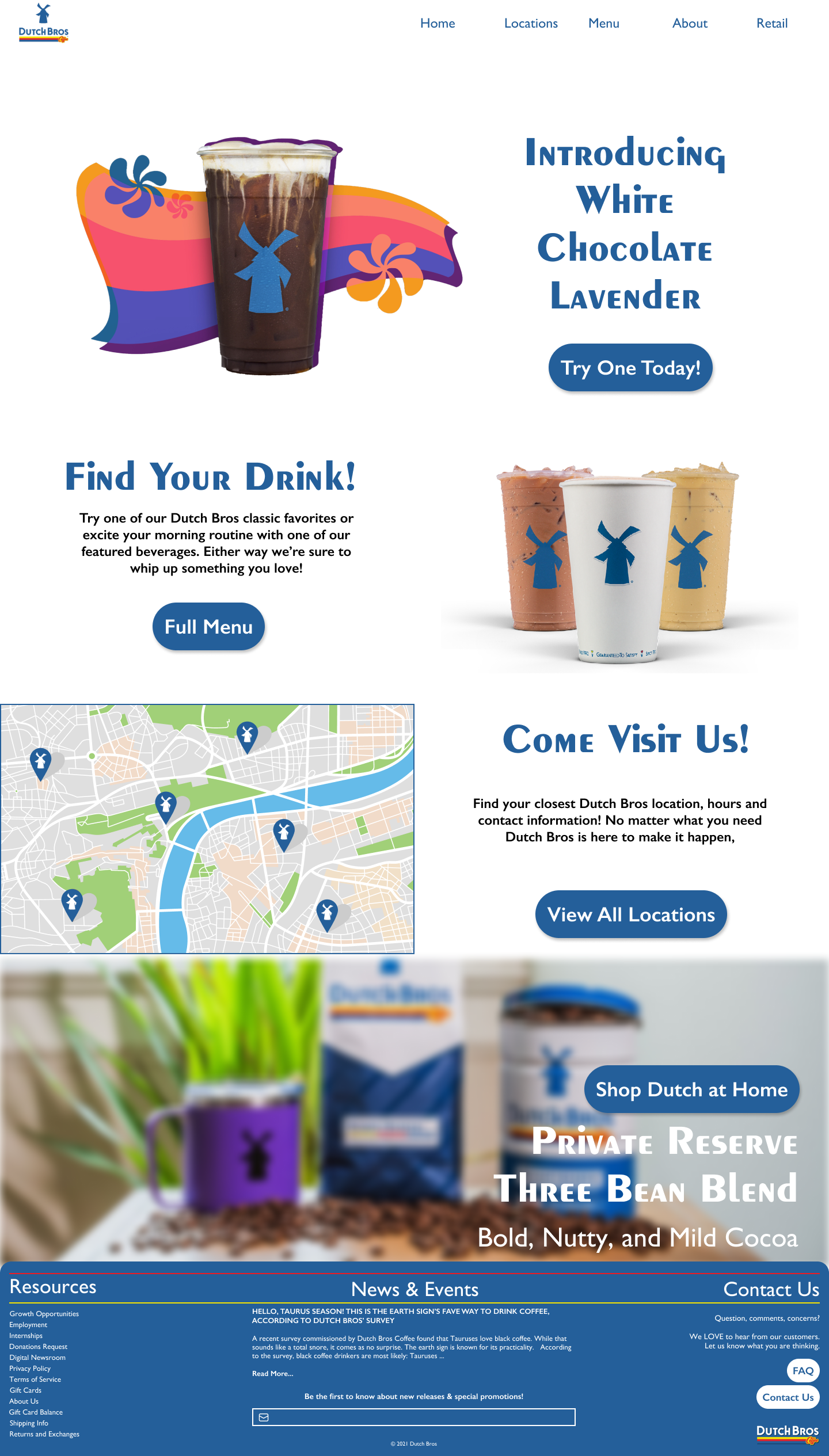
Navigation was one of the most significant usability issues, as it impacted every page. I replaced the hamburger menu with a horizontal navigation bar, reducing interaction cost and improving discoverability of key actions.
To better prioritize user needs, less frequently accessed corporate content (e.g., Our Story, News & Events, Foundation) was moved into a collapsible sub-navigation, allowing primary tasks to remain prominent.
Additionally, I unified the previously separate online shop and main website, consolidating their content into a single, comprehensive footer. I also improved accessibility by increasing contrast in the header and introducing the full-color logo against a white background.
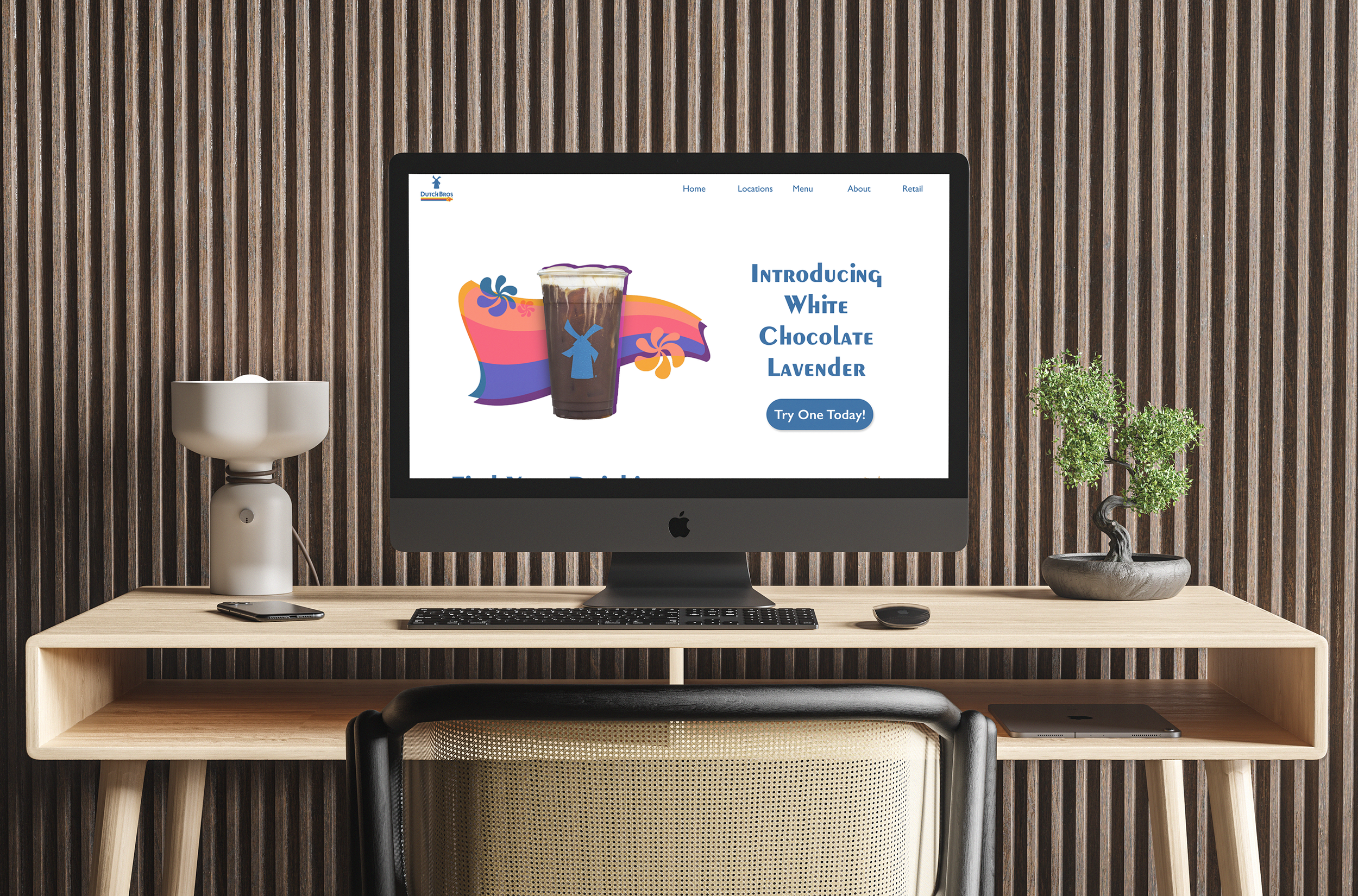
Homepage Redesign
The original homepage presented users with too many competing actions and unclear calls to action. I simplified the experience by focusing on the most goal-driven tasks:
Ordering
Menu & Nutrition
Locations
Retail
This reduced cognitive load and aligned the page with primary user intent.
To reinforce brand consistency, I standardized typography using Dutch Bros’ signature Peignot font and created a consistent call to action system using elongated blue buttons with white text, applied across the site.
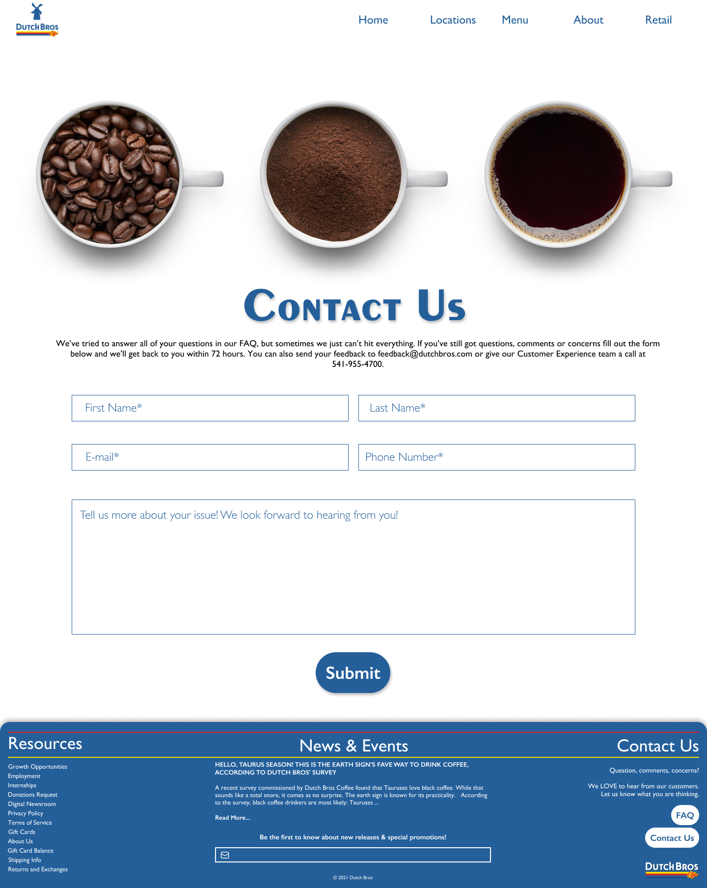
Contact Experience
The original site lacked a clear way for users to get in touch. I introduced a dedicated Contact Us page, including:
A simple feedback form
Customer support email
Customer care phone number
This addressed a major trust and usability gap and provided users with clear support pathways.
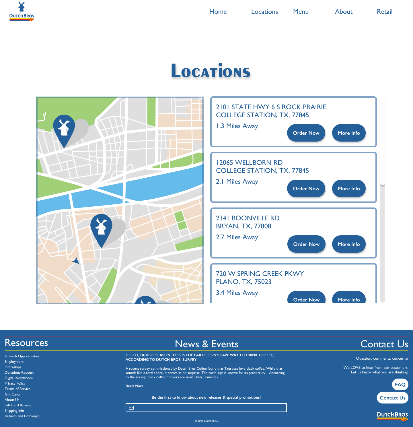
Locations Experience
The existing locations page did not meet user expectations, particularly around proximity-based search and ordering.
I redesigned this experience with:
A side-by-side map and location list
A clear indicator of the user’s current location
Listings organized by nearest to farthest
This made it easier for users to quickly find and act on nearby stores.
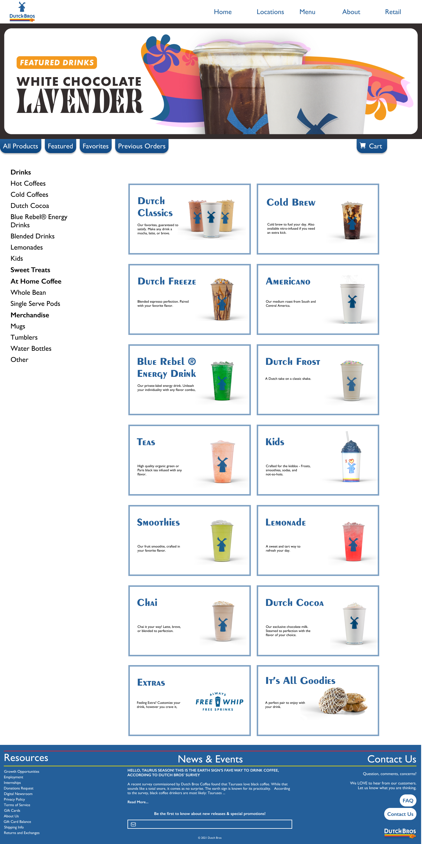
Ordering, Menu & Retail Integration
The most extensive redesign focused on unifying the ordering, menu, and retail experiences into a single, cohesive system.
Key improvements included:
Combining previously separate flows into one seamless experience
Introducing tabbed navigation for easier browsing and discovery
Enabling personalization through favorites and previous orders
Adding a filterable sidebar for more efficient product exploration
Integrating a cart system to clearly support purchasing actions
Interactive elements such as hover states were also introduced to improve affordance and clarify clickable areas.
Results
While this project was completed in an academic setting without access to live metrics, the redesign targeted high-impact usability issues that would likely influence conversion and engagement. Key improvements included reducing steps in navigation, consolidating the ordering experience, and prioritizing primary user tasks.
The work was evaluated with a perfect score, demonstrating strong problem framing, UX decision-making, and execution.
Reflection
Overall, this is a great beginning for improving the experience of Dutch Bros website; however, extensive effort should be put into revenue producing features such as the store and online ordering as well as an awareness of the customer experience which it seems is lacking based on the difficulty of trying to contact an establishment.